There's an explanation at the bottom of the page.
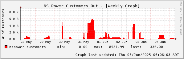
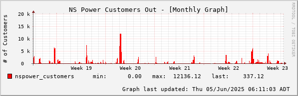

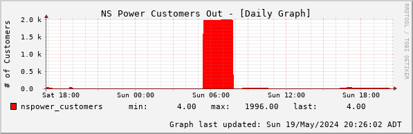
Red graphs are affected customers - e.g. households or businesses, several people per household.
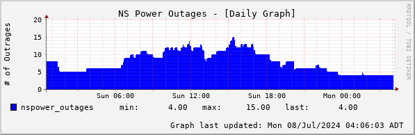
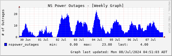
Blue graphs are outages, bad transformers, breaks in lines etc, with one or more customers per outage.
Very often after a storm, the number of affected customers goes down while the number of outages goes up because the linesmen find smaller outages nested inside the big ones.
Questions about these graphs? Contact: NSPower_Outages @ bonmot . ca